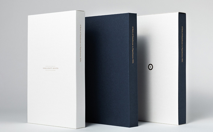
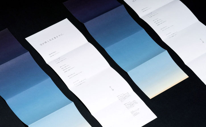
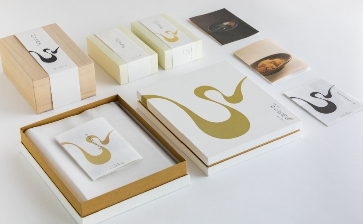
Park Hyatt Kyoto Story Book
Graphic
Ō BEER KYOTO
Branding CI VI Graphic Web Package Signage Movie Photo
Kashifuji
Web Photo
halo clinic
Branding CI VI Web Signage
Joseph Phelps
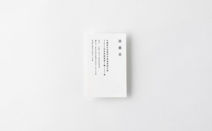
MATI Alliance Support Organization
CI VI Graphic Web
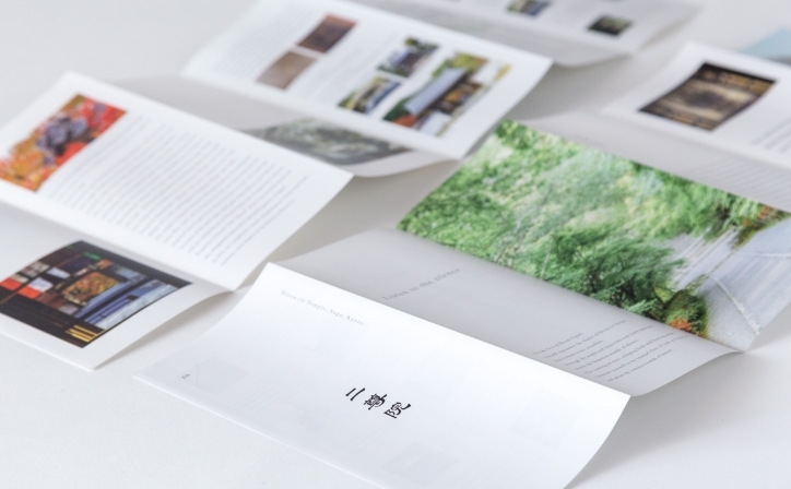
Nison-in
Branding Graphic Web Movie Photo
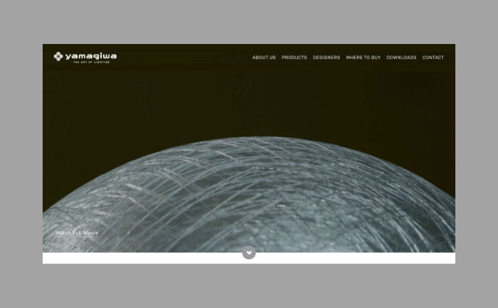
YAMAGIWA Global Website
Web Movie Photo
MATSUI ARCHMETAL
Branding CI VI Graphic Web Signage Photo
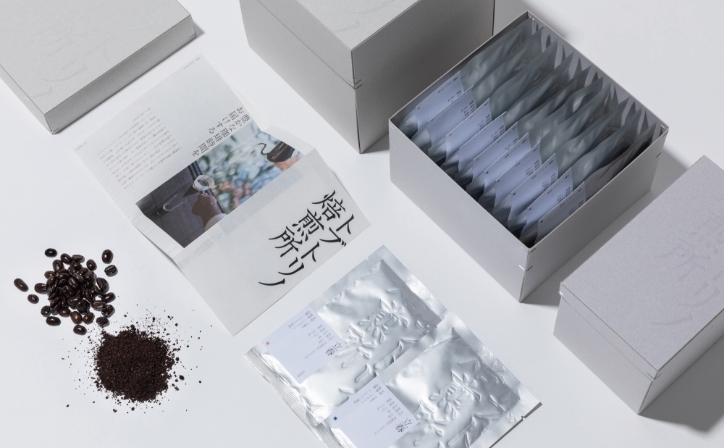
Juhmokusha
Tobutorino Baisenjo
Branding Graphic Package
Park Hyatt Kyoto
TOA SEIKO
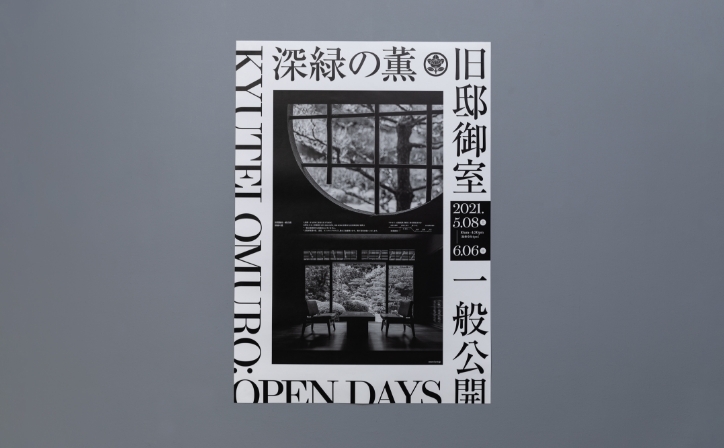
Kyutei Omuro
Branding Graphic Web Photo
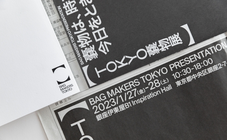
BAG MAKERS TOKYO
Branding CI VI Graphic Web Movie Photo
ZAZAZA
Medio Critas
Branding CI VI Graphic Web
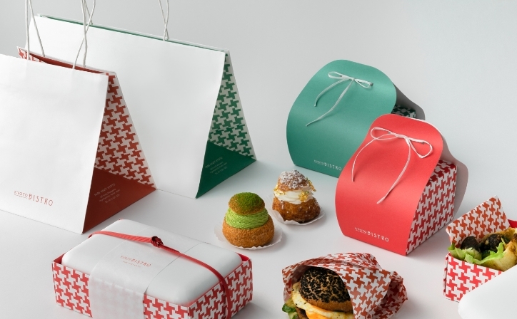
Park Hyatt Kyoto KYOTO BISTRO
Graphic Package
Kabe Sho
Branding CI VI Graphic Web Photo
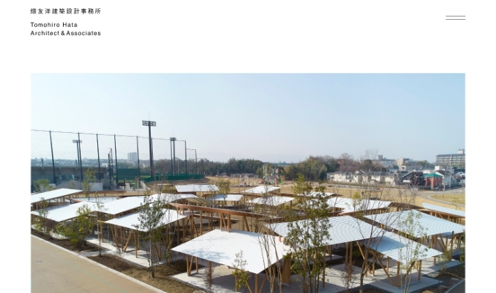
Tomohiro Hata Architect & Associates
Graphic Web
Ocean Trading Co., Ltd.
Branding CI VI Graphic Web Signage
sayu
Branding CI VI Graphic Web Signage Movie Photo
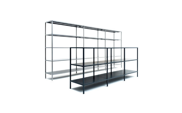
JUST SHELF
Branding CI VI Graphic Web Movie
Ehon Hotel
ambient
Panasonic Design Kyoto
CI VI Graphic Signage
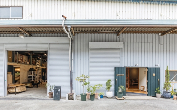
enstol
Branding Web Movie Photo
hakobe
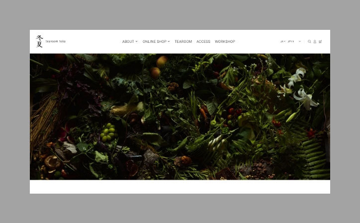
tearoom toka
Web
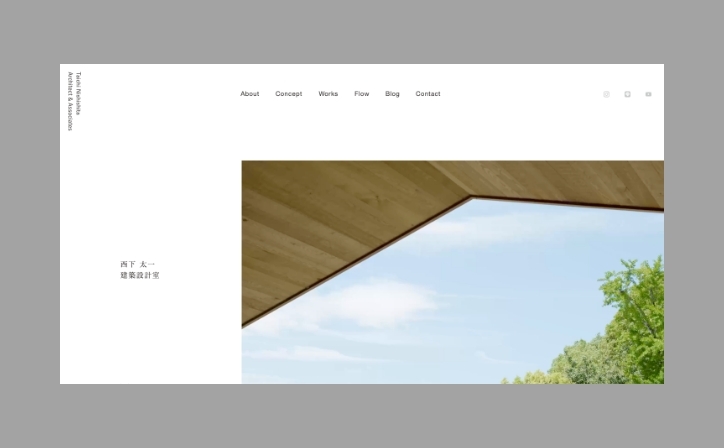
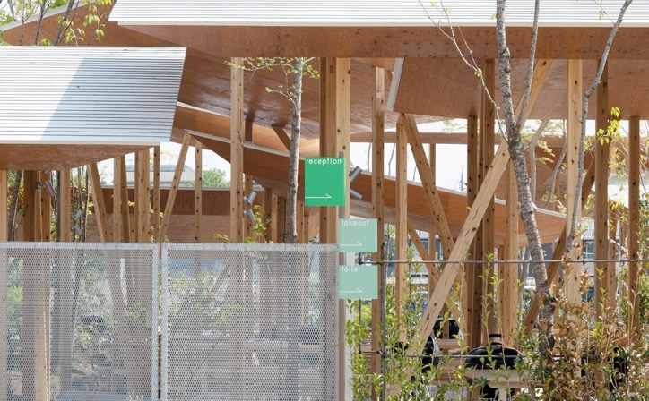
Taichi Nishishita Architect & Associates
Graphic Web Movie Photo
Hotel Lodge Maishima
Branding CI VI Graphic Web Package Signage Photo
Naoshichi Hoiten
THE SHINMONZEN
Branding Graphic Web
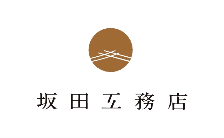
SAKATA Corporation
Nandaimon
CI VI Graphic Package
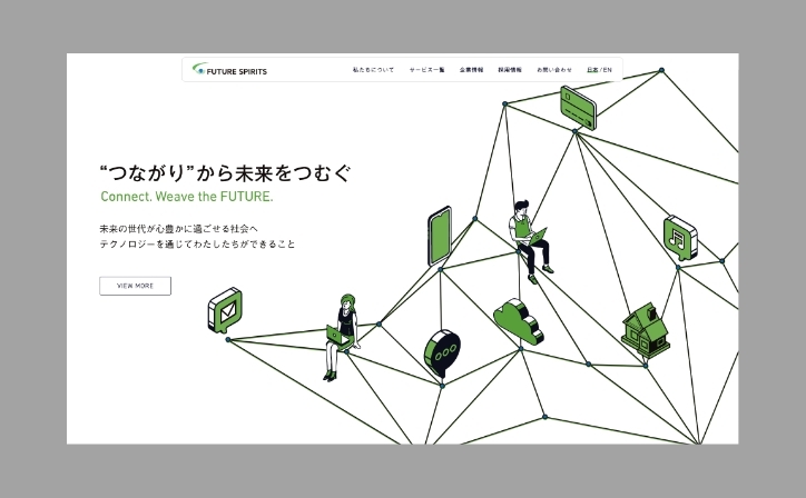
Future Spirits
Toshiharu Ryokan
IKI CORPORATION
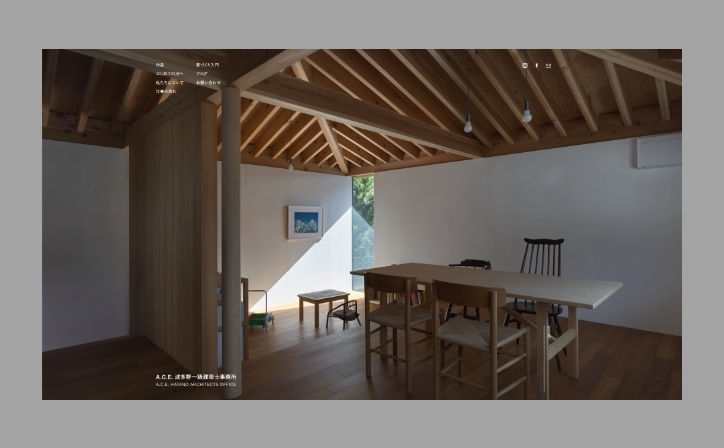
A.C.E. HATANO ARCHITECTS OFFICE
Think&Act,Inc.
MIWA
Branding CI VI Graphic Web Package
Ao to Kai
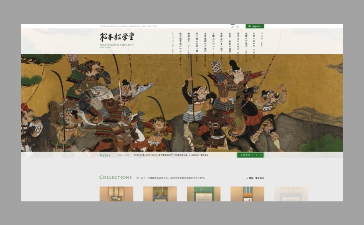
Matsumoto Shoeido
Mori to Rill no BBQ Field
Branding CI VI Graphic Signage Photo
Miyawaki Baisenan
Branding Graphic Web Package
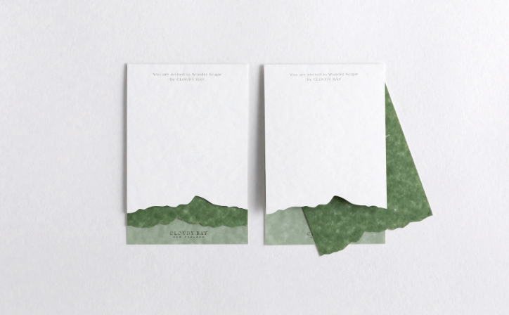
CLOUDY BAY
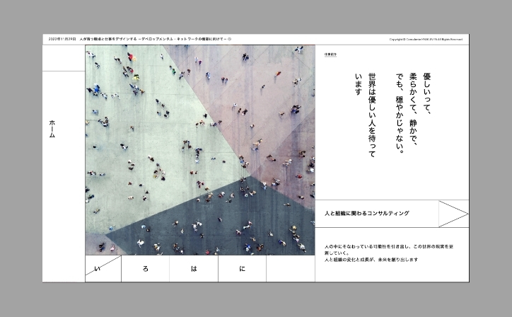
Consulente HYAKUNEN
TTT
Branding CI VI Graphic Web Package Signage Movie
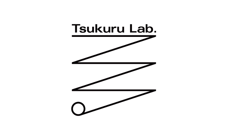
Tsukuru Lab.
Branding CI VI Web
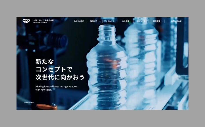
TAIYO ELECS CO., LTD.
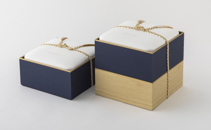
Park Hyatt Kyoto CHRISTMAS HAMPER
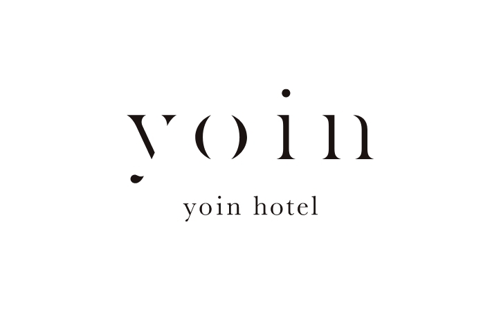
yoin hotel
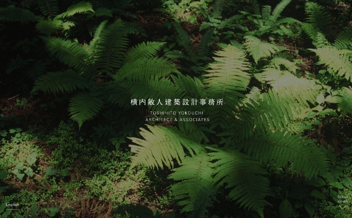
T.Yokouchi Architect & Associate
matoi
TABITABI
CI VI Web Movie Photo
HANPLUS
Graphic Web Photo
BBQ & Co.
Branding CI VI Graphic Web Package Photo
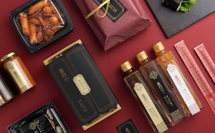
Warabi Shoten
Branding CI VI Graphic Package Signage Photo
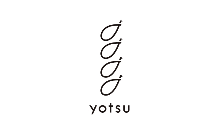
yotsu
Branding CI VI Graphic
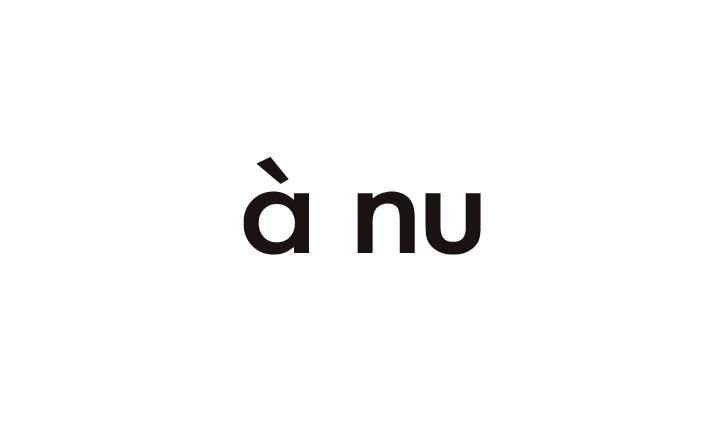
à nu
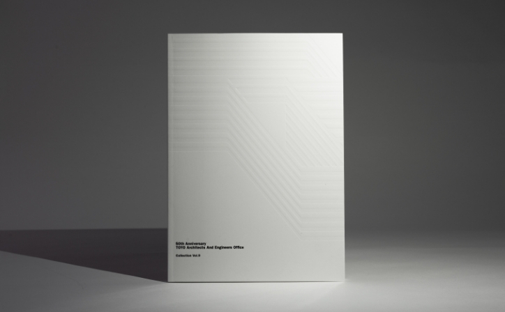
TOYO ARCHITECTS AND ENGINEERS OFFICE
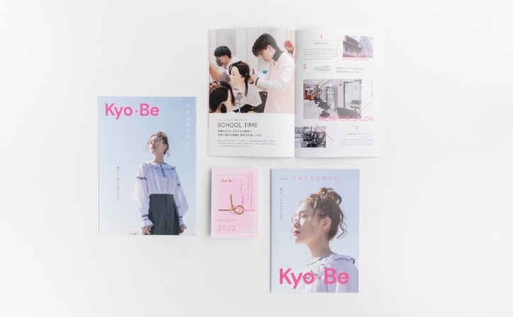
KYOTO BEAUTY COLLEGE
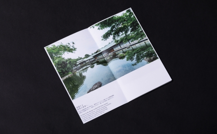
Saga Arashiyama Museum of Arts and Culture
The Kyoto State Guest House
Graphic Photo
Rooftop Guitar Works
Heavenly Aroom
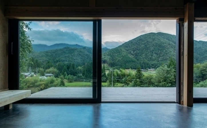
kawaue residence