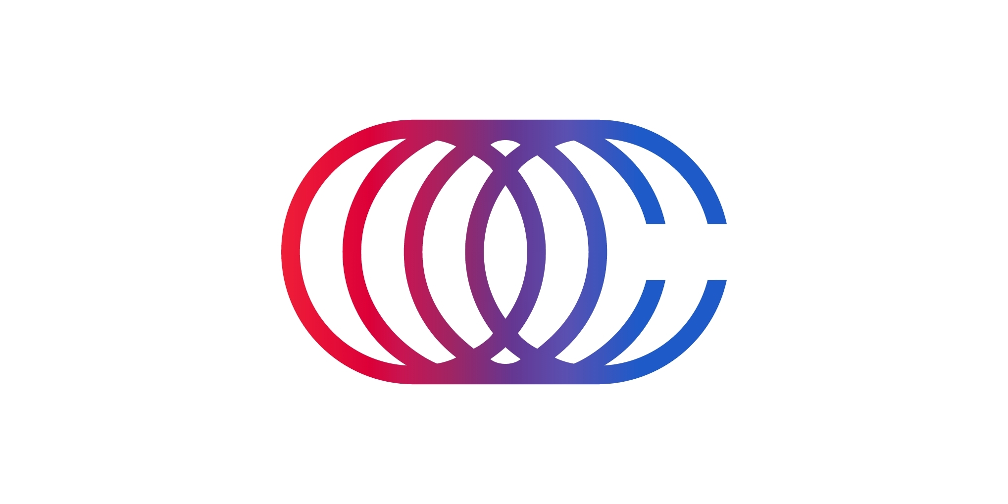
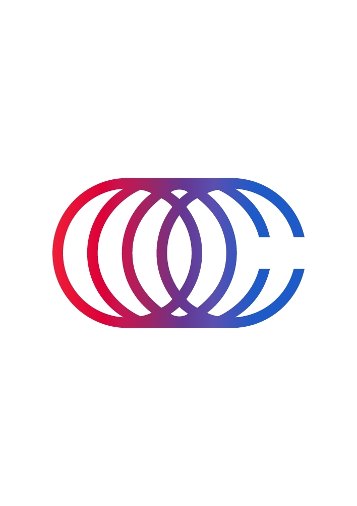
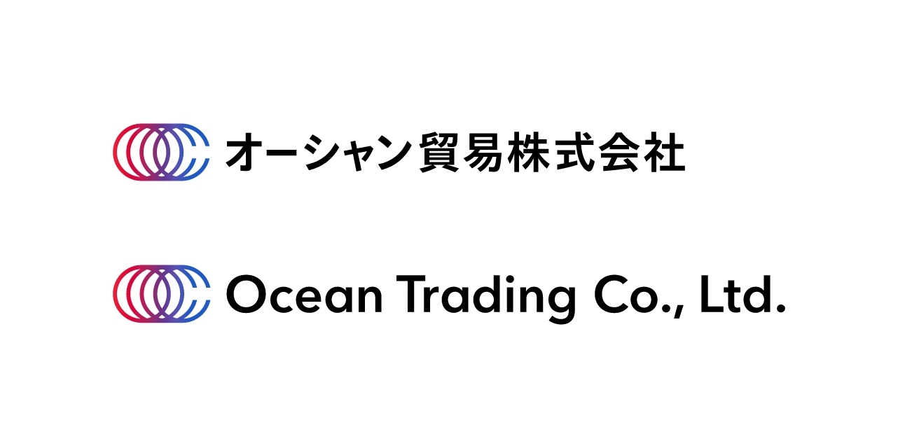
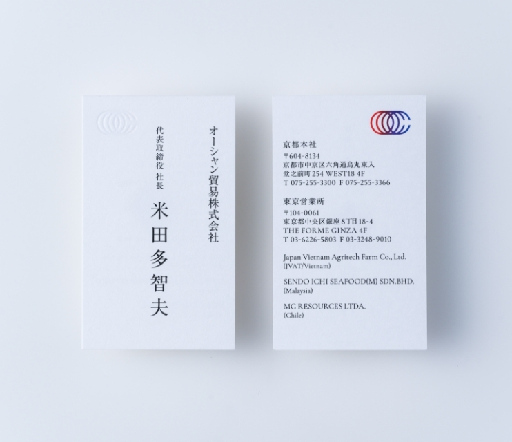
We rebranded Ocean Trading Company, a trading company based in Kyoto.
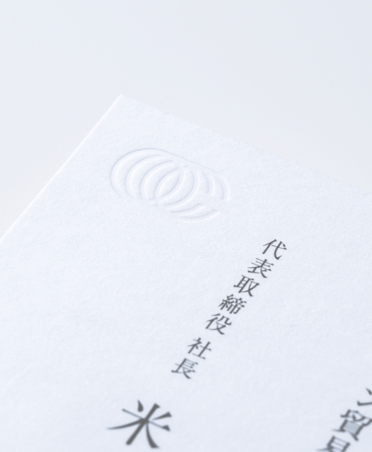
The corporate logo is based on a world map, using the 'O' and 'C' of Ocean.
The multiple lines of the logo represent the meridian lines of the map, and Ocean Trading's ongoing efforts to advance on the world stage.
The colors red and blue, which are reminiscent of arteries and veins, represent the dynamism and metabolism of a business and also overlap Ocean Trading's history of breaking out of the Red Ocean (a fiercely competitive market) and pioneering the Blue Ocean (an untapped market).
CI VI
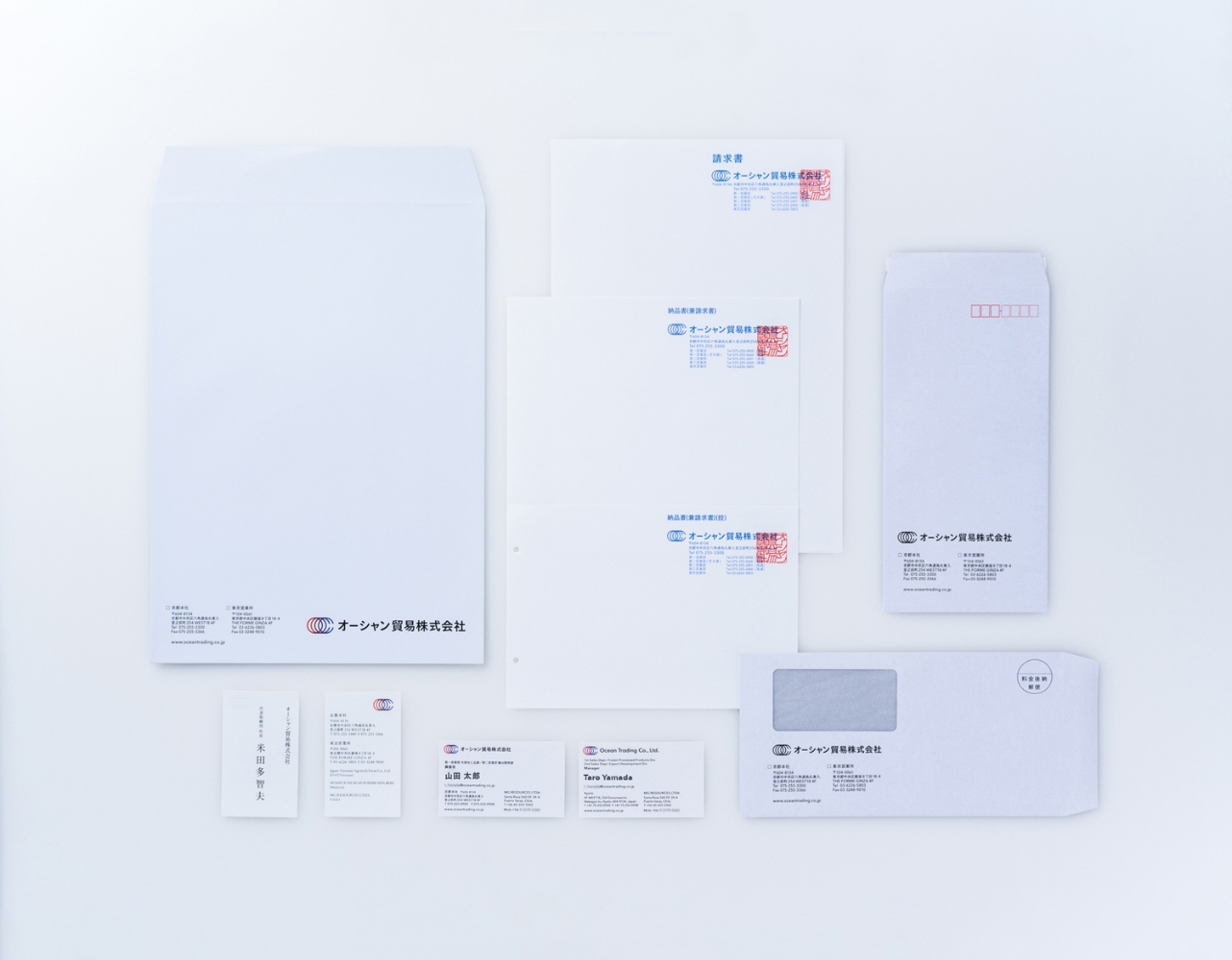
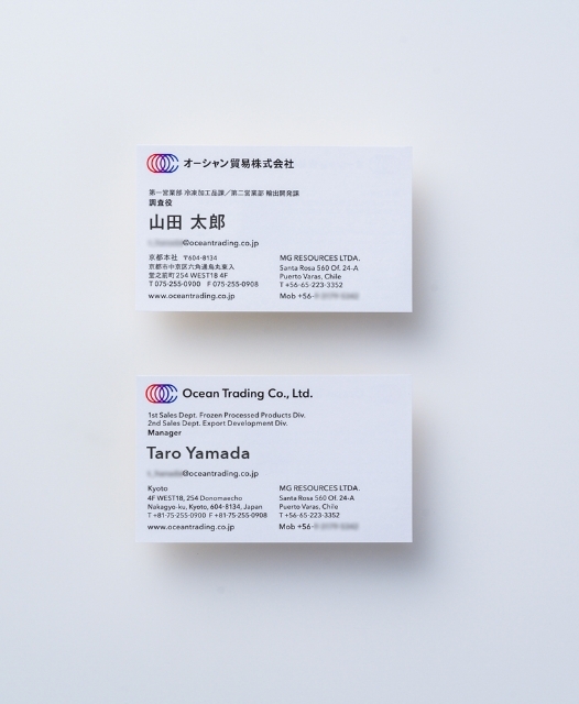
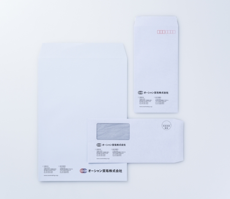
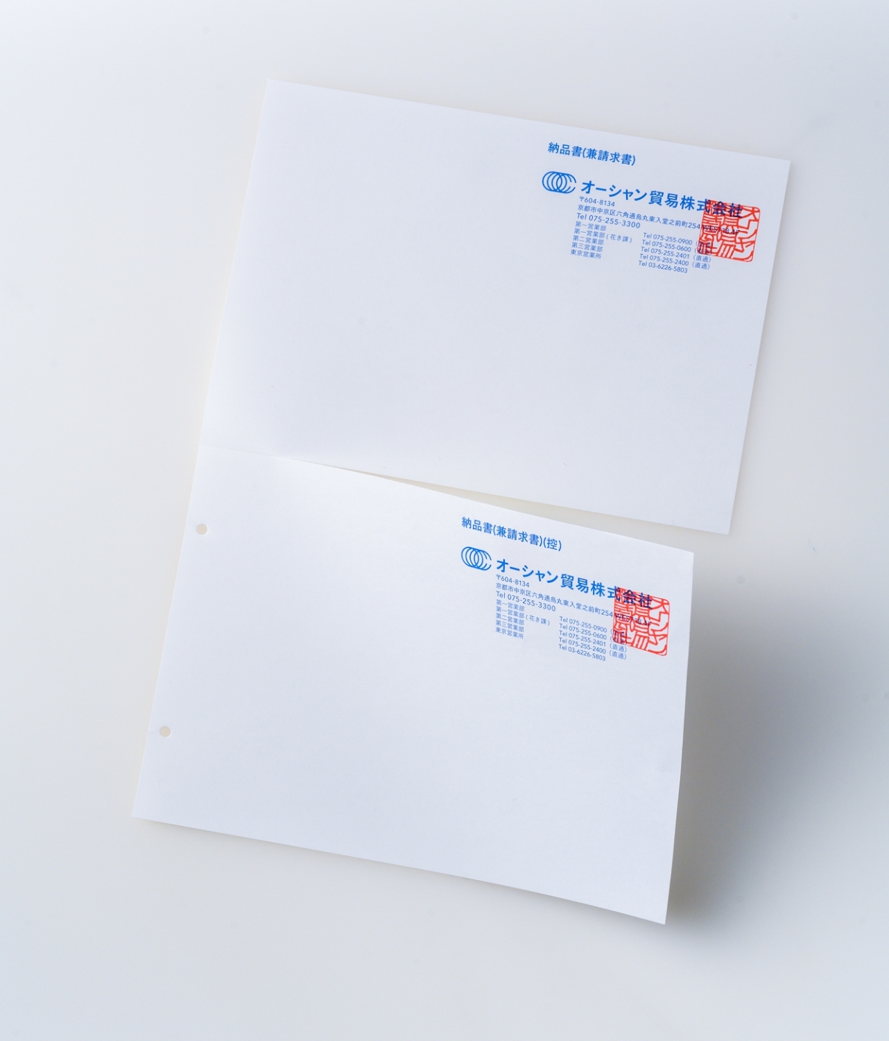
Graphic
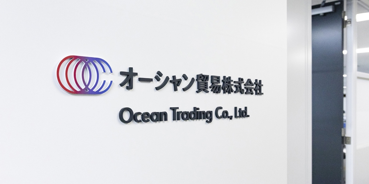
Signage
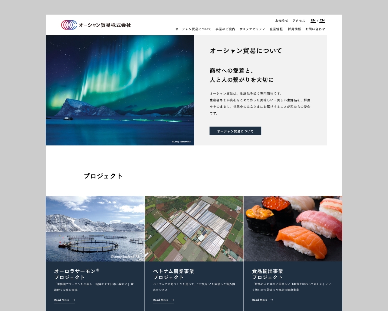
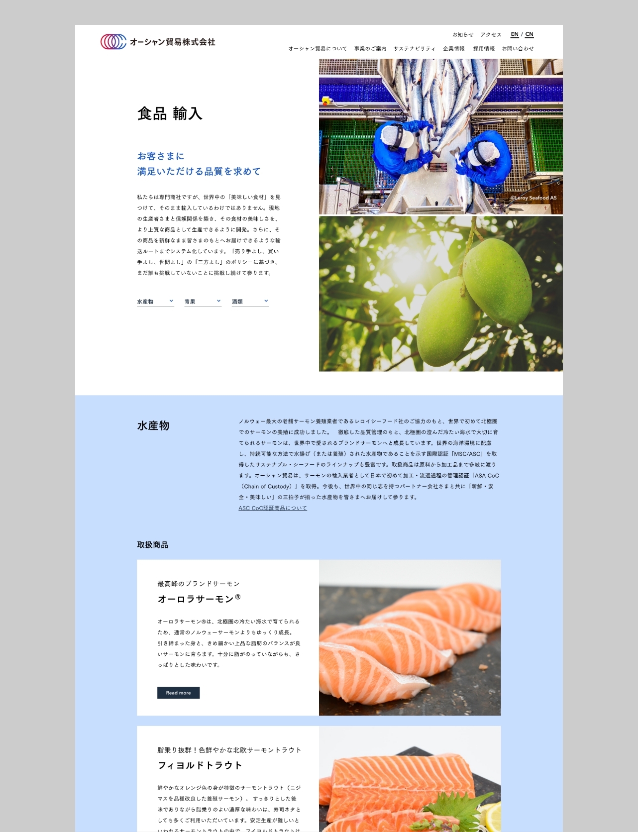
Web
Ocean Trading Co., Ltd.
https://www.oceantrading.co.jp/Ocean Trading Co., Ltd.
https://www.oceantrading.co.jp/Client
Location
Art Direction
Direction
Designer
*:external